

HONEST & FAIR FROM THE INSIDE OUT
Peanut butter. A hero that fits so many recipes. But this is not just a normal peanut butter; JAY stand for honest & fair peanut butter that aims to re-green the planet, so our generation and the generations to come can enjoy the products Mother Earth gives us.
JAY Peanut Butter (Concept)
Brand Identity, Packaging & Social Media
2023
Client
Skills
Year

Opportunity
AN HONEST PRODUCT DESIGNED TO GIVE BACK
Originated from the idea of making an advertisement for an organic & fair product, without using the obvious visuals. We deliberately ignored shades of green, icons of leaves and trees and other 'organic' visuals in order to build an identity that still conveys the message, without doing so in the obvious way.
THE LEGACY FORMULA®
BRAND IDENTITY
With this identity we have chosen to look at what exactly we want to convey. JAY is not afraid to trigger people and stand out. Instead of subtly hiding the message, we chose to bring it forward. To make it visible & audible - to give it the podium it deserves.
What we did
• Creative Direction
• Logo Suite
• Type & Colour Sets
• Brand Styling
• Photography Direction
• Brand Guidelines

THE LEGACY FORMULA®
COLLATERAL DESIGN
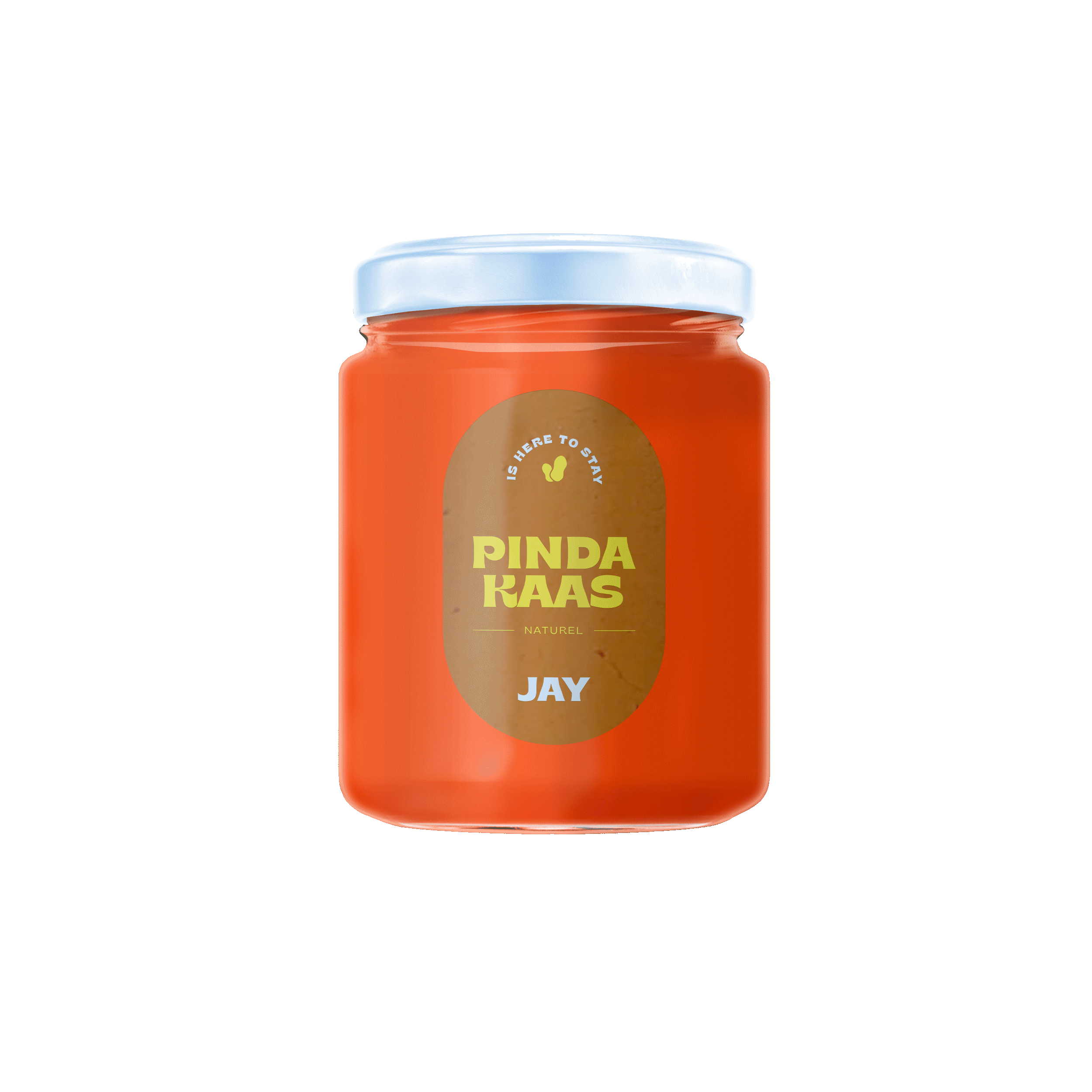
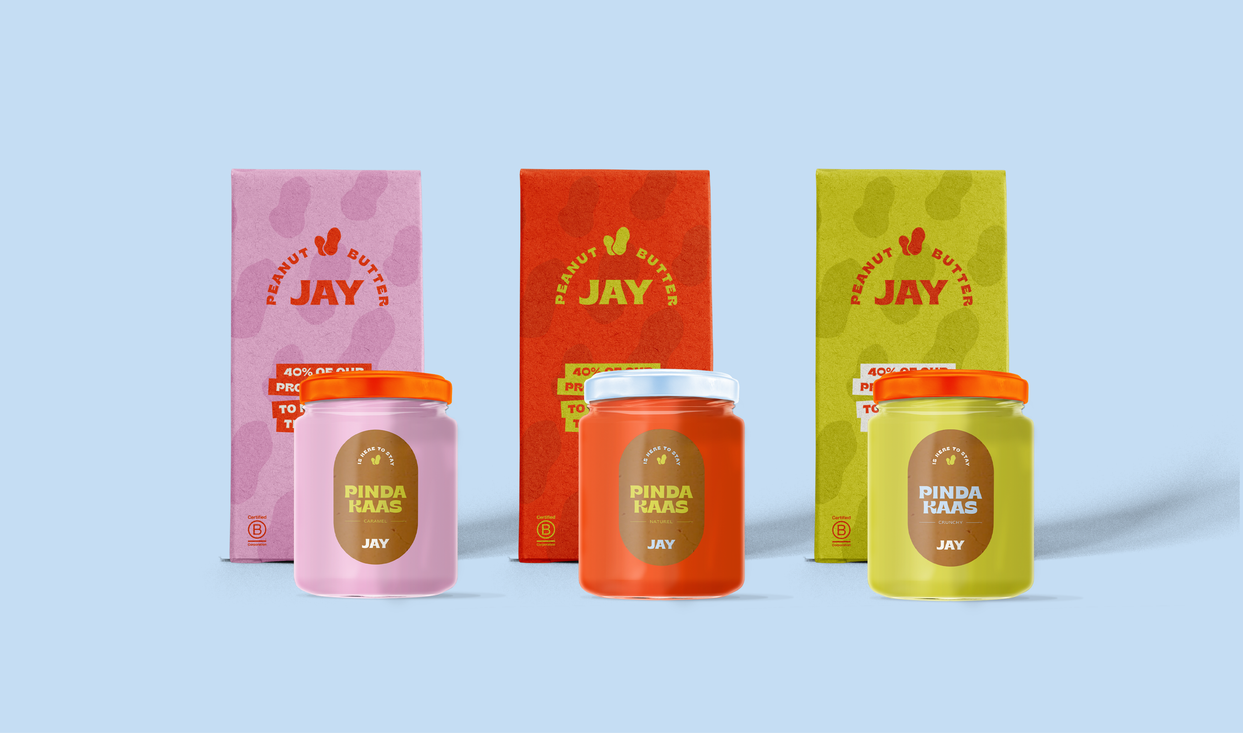
JAY stands out in the supermarket peanut butter aisle, breaking the norm of brown jars with small labels. Our packaging is visually striking, offering a glimpse of the contents. On social media, we showcase not only our product and its surroundings but also the fun side of JAY. Social responsibility doesn't have to be boring. Our advertisements are slightly provocative, staying true to the essence of JAY.
What we did
• Social Media Design
• Advertisement Design
• Packaging
